During the face to face event at Falmouth I arranged a number of portfolio reviews. For my review with Michelle Sank I shared the portfolio of images from the different projects I have developed during the MA fine-art-portfolio-18th-february-2018. Michelle was provided useful feedback plus an number of contemporary photographers to consider.
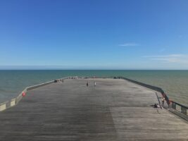
Her feedback on the images was to always consider the complete frame as what might be at the edge of the frame is important when getting the reader to focus on the content of the frame. She made particular reference to the image of the towers used to unload grain near tilbury where she felt a square crop of the image could have more impacts removing the distraction of the conveyer belt to one side of the quay. Look at cropping into specific parts of the pier structures and use those elements to create a frame for the reader.
Michelle felt the work from points of departure and the filter house both had typographic qualities.
She suggested I look at the work of Hilda and Bernd Becher where they use a very distinct style to capture subject such as the Gas Towers.
She advised looking at Hiroshi Sugimoto’s work Seascapes as another source of inspiration for my current project.
Actions:
- Look at Hiroshi Sugimoto’s work as a source of inspiration to help refine the style of images created when working with Landscapes.
- Analyse the images created by the Bechers to determine how a typographical style can be applied within the project.


