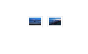
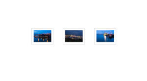
Based on work from the first few shoots since the start of 2018 I decided to create an initial set of layouts for the gallery, rather than creating layouts for all of the wall space I decided to focus on one side wall and the back wall of the gallery. The reason for focusing on these areas only was to conduct some initial experimentation as in previous shows I have only had limited wall space for the layout. Having a complete gallery allows me use space to create pauses between different images and to place others closer together so that he combined images can take on a different interpretation from a singular image or having different images run into each other.
I decide for the initial layout to work with the sizing that I had provided to the gallery when getting an estimate for framing the prints. The intention is to use a white surround and white frames to allow the frame to merge into the wall.
Grouping of images


Analysis
The start of the left wall section 1 with the three images felt like a natural triple and felt strong as a group. I then placed the image of the Bradwell Creek Marina as a single image because I do not have other images that are similar to that image. The next pair of images from Canvey Island and Harwich felt like a natural left and right handed pair and created a closed loop a form of agreement or meeting of minds. The final pair of images are from Brightlingsea and Clacton they are both landing stages that are on slightly divergent paths though I am not sure they necessarily sit well together as a pair.
The second part of the left wall is a short section and I decided to only place a pair of images in this section. One image from Southend-on-Sea Pier and the second from Clacton Pier similar to the last pairing on reflection they do not really sit well together. I think the Southend-on-Sea image is probably the stronger of the two.
I decided I wanted something stronger on the back wall and selected three of the images that contain additional colour. Each image is of a slightly different theme so I place them equidistant apart though I do not feel they represent the strong outcome I want or need to draw people towards the back of the gallery. This part of the space needs further consideration.
