I entered some of the images from the ‘Points of Departure’ Work in Progress to a LensCulture competition in January and the review feedback has arrived today.

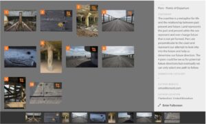
I chose your series to review your series because I find it visually interesting. I have taken some time to study your photos, while looking at your statement. You talk about how the “coastline is a metaphor for life and the relationship between past present and future.” I never thought about it, but can see it’s true. I see how the coastline is ever changing based on the actions of constant natural forces. Like life, sometimes there are calm, tranquil days and other times there are the crushing waves from a hurricane! Forever in flux, in a state of constant change.
As a result, your series seems very contemplative. There are even elements of solitude and loneliness. For example, the empty piers, the deteriorating structural supports, and even the lone footprint speak about an absence of human life. To me the photos also speak of mental and emotional states. The photos are like memories or windows into dreams. I think your perspectives and your photographic observations are fascinating in relationship to the statement. Knowing what you are thinking about adds an additional way for the viewer to approach and understand your photos. But, for me, the images are beautiful just as they stand as a series and individually.
I find these photos mysterious because they speak about the intimate connection that you have with places that cause thoughts and emotions to arise. You capture images that go straight to the viewer’s psychological and emotional imagination. They are dramatic, rich with possibility and evoke feelings of curiosity and wonder.
On the surface these images have a type of visual complexity that concentrates on rich tonality, patterns, lines, and the way the elements become ornaments in imaginary environments (especially in photos 2, 3, 5, and 9). In addition to being visually complex, I find them to be conceptually complex! You challenge the viewer to look deeply and consider the possibilities! I definitely see that you captured patterns, textures, and shapes that reveal “places” where it is impossible to know the context of the objects. The images also function in a way that communicates your experience to the viewer. Anyone that is willing to set aside their compulsion to have to identify what they are looking at will relate to the feelings your images communicate.
On the surface some of these images focus on abstract shapes, like 1, 2, 9, and 10. To me, the photos are interesting because they incorporate compositional, poetic design. These visual effects are clearly important characters in your stories. I think you are also asking that the viewer be sensitive enough to look deeply at your images, to see the details you have included in the frame and to consider the issues you talk about in your statement. Part of the magic of these images is what you have chosen to include in the frame and all the elements in the surrounding environment you deliberately choose to leave out. The way you frame the images somehow purifies the photo by removing elements that would dilute its emotional impact (if that makes any sense?).
I have thought about suggestions for where you could go from here. My first suggestion is to be very aware of being attracted to the center of the composition. Don’t feel as though you need to be stuck with the rectangle the camera gives you. In my opinion, several of these photos could be strengthened compositionally by cropping them into squares. Many of your photos are visually weighted in the center, with a horizon that falls across the center. For example, photos 2, 3, 4, 6, 7, 8, 9, and 10 all are composed in a way that leads the viewer’s attention to the center (see my cropping). As photographer Rick Sammon once said, dead center is deadly. Even moving the emphasis slightly off center. By counter balancing the focal point of the photos with some other visual element will make the composition more visually dynamic.
Cropping would also help condense and intensify the atmosphere/mood in the images. As you continue with this project, consider trying out the square format. Just consider as an experiment, masking your viewfinder into a square and see how it works for you. Your images are unique in that they represent your unique vision of these scenes.
My second suggestion is to increase the sense of visual and emotional drama by converting them to black and white. Photo number 5 is essentially black and white anyway. As long as your lighting has a lot of contrast and you are not relying on color, then give black and white a try. Who knows, you may be a black and white photographer?
Your images are very dynamic. They are full of mystery and beauty! Your images are clearly part of a process that is very personal and who knows where it will lead. Also, don’t feel like you need to be married to the photography world. My advice is that you enter juried art exhibitions and/or show your work within art communities. I think that your images would do well in an “art” environment. Your photos really do cross a lot of boundaries, which is highly encouraged in the art world.
I very much enjoyed looking at your photos and thinking about the ways they express your straightforward and emotional photographic approach. I appreciate the way your images are masterfully considered and carefully designed. I look forward to seeing what you will do next!
There are a number of positives to takeaway from this review. The fact that the images worked as individual images and as a series in the opinion of the reviewer. I am pleased with the messages they picked up in the different images and the relationship with the story i was looking to convey through the images. I will further refine my approach with respect to position of subjects within the frame.


