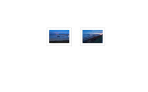
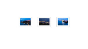
During the last couple of month, I had explored a number of different layouts and printing and framing options. The prints for the exhibition are now printed and I am happy with the decision to hang the work in frameless images however the exact nature of the hang still does not feel correct. The version with the portrait prints at different highs on the wall is interesting though I would like to have a large number of prints and of the same location and position them to reflect the tidal cycle of the coast.
The fourth layout where the landscapes and the portrait images are on separate hang lines for me does not really work with the width of the gallery or ceiling height as one set of images will either be too low with the other set too close to the ceiling. In a different setting, the configuration might have worked.
I, therefore, decided that a final layout was required before taking the work to the gallery, as I prefer to have a hanging plan defined before installation day. This approach allows the hang to progress smoothly and avoids late changes that can delay the hang and ultimately cause frustration with the team. The installation team was only going to be two people and we had 23 prints to hang plus multiple other pieces to install.
For the final hang layout I decide to retain the concept from Paul Graham’s MOMA exhibition ‘Shimmer of Possibility’ and the concept from the Magnum Portfolio review. The hang was based on a constant line running around the gallery which would represent the top of all of the images. This would place the centre of the landscape images at the average adult’s eye height. The images on the left and right wall would be organised into the 7 groups based on the EU Withdrawal Agreement, 3 on the left side and 4 on the right side. The portrait-orientated images were then grouped with between 1 and 3 landscape images. Some of the landscape images are arranged as diptychs. Creating the effect that the portrait image then formed a diptych with the landscape diptych conveying additional meaning within the overall context of each image group.


