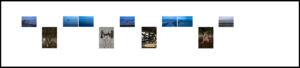
During the Group Critique with Krishna Seth I received feedback on the previous version. The feedback was that the group did not feel that the abstract images were as strong when compared to the other portrait orientated images so I decided to remove those from the image selection. The other piece of feedback was related to the relative placement of the landscape orientated images compared to the portrait orientated images. On the basis that the portrait images are images that focus on superstructure I placed those images on a lower level and the landscape orientated images on the higher level. Though placement of the two levels was restricted due to the ceiling height of the gallery. The width of the was another consideration when deciding of the layout.
On reflection the layout would work better in gallery space with extra ceiling height plus the layout did not support the coastal journey or the United Kingdom departure from the European Union. The experiment was worth the time only to conclude that this was not the correct layout for this show.